Thursday, September 12, 2013

Crossing Party Lines with Predictive Modeling

With the rise of Nate Silver and the emergence of mainstream data science, we've seen many uses for predictive analytics, including the entrance of predictive modeling into the political arena. Actually, although predicting election results is a booming business now, it has been around for quite some time. 

I recently got the chance to talk to Matt Hennessy, Managing Director at Tremont Public Advisors, about a campaign he worked on for Joe Lieberman in 2006, and how they implemented predictive modeling for a successful Senate election. For those who are interested, we'll be discussing this and other examples of predictive modeling in action in a webinar on Tuesday, September 17th. 

Can you give us some background on the 2006 Senate election?

In 2006 in Connecticut, Joe Lieberman was up for reelection to the Senate as a Democrat. He had been the Vice Presidential nominee in the 2000 election and had taken a position supporting the Iraq war which upset a lot of the Democratic base. He wound up losing the Democratic primary to Ned Lamont who won on a big anti-war push. Once Lieberman lost the primary election, he lost access to a considerable amount of infrastructure – union support, door to door field workers, and all of the other boots on the ground that he would have had were all gone. He lost most of his staff except for the people who had been there for a decade or two. He needed to figure out how to replace some of the advantages he’d had with other resources out there.

As someone advising him, I saw that we had a problem: without a field operation and all of those bodies, we didn’t know exactly who we wanted to get out the vote and who the likely voters for Lieberman were. We had a very expensive polling operation going which  was using the conventional method to reach some conclusions about which demographics were most likely to vote, but we decided that we needed something more.

How was the decision made to use predictive analytics in the campaign?

The resources that normally would be used for generating ‘get out the vote’ or direct voter contact were gone the day after the primary. Usually we’d go out and try to visit all of the potential voters, but this just wasn’t possible anymore. We needed to figure out a way to work smarter to compensate for a new lack of resources. We wondered if there was a way to determine which characteristics indicated a likelihood of voting for Lieberman so that we could figure out exactly who to pull out on Election Day. After a conversation with Mike Laracy about performing this type of analysis, we decided to give predictive modeling a try. Our goal was to score every registered voter on their likelihood of voting for Lieberman, and we used Rapid Insight to build a model to do that.

We knew what data we had, the voter file, and determined which additional information we would need to build a model, like demographic information. Then we hired a polling company to call about 10,000 named voters in a random phone pull so that we’d have a statistically significant result. The poll question was a very simple yes/no question on likelihood to vote and who each voter planned on voting for. We weren’t trying to persuade people at this point; all of this polling was meant to influence the field side, not the messaging side. This approach was different than what we’d been doing before because we were calling named voters – people who actually existed and were registered to vote and had demographic information that we could attach to them – and polling them. Using this poll, we scored each of the 1.9 million registered voters in  Connecticut on their likelihood of voting for Senator Lieberman.

How did predictive analytics help the campaign?

Predictive modeling allowed us to optimize our limited resources. As opposed to working with pure assumptions, we now had an actual score attached to each individual voter, which allowed us to spend our resources on the voters with the highest propensity to vote for Lieberman. At the time, it was quite a cutting-edge use of analytics – it was the first time anyone had ever scored an entire state’s voters for the purposes of an election.

Another thing the predictive model did was to disprove our assumptions about who was likely to vote for Lieberman. Some of the key indicators that we were getting from the traditional pollsters were proven to be incorrect by the model results. Based on this we changed some of our campaign messaging The model allowed us to re-allocate our resources more efficiently and it challenged some of the notions we held. In the end, the model did a good job of predicting who the voters would be.

Do you think predictive modeling affected the outcome of the election?

It’s difficult to say, but I can say that the resources that were deployed based on the predictive model were effective. Once we started deploying based on the modeling, the polling margins started to increase; this was toward the end of the race, which is when this model was implemented. I think it increased the margin of victory. The polling was showing a very tight race, but the predictive model was showing there was a margin of victory for Lieberman that was already there, and it was actually ahead of the polling in this case.

How do you see predictive modeling being used in future elections?


If you look at what the Obama campaign did with predictive modeling – taking different factors and a complex web of data points to pinpoint individuals who are likely to vote – it’s here. Predictive modeling is here, it’s now; that’s the future of elections. The complexity of the work they’re doing in this field is truly amazing. I don’t think it will be as focused on many of the smaller races – like those below governor, but it can be very, very effective. I think this last election confirmed that it’s a major part of any political campaign that’s being conducted on scale. This is here to stay.

This example of predictive modeling in action is one of three that we'll be co-presenting in a webinar with Tableau on Tuesday, September 17th, "Turbocharge your Predictive Models with Visualizations". For more information, or to register, click here

*
Matt Hennessy has over two decades of experience in federal, state, and city government. He has built a reputation as a trusted and effective advisor to leading elected officials on public policy, communications and campaign issues. He has served as a trusted political advisor and fundraiser for candidates and political campaigns ranging from Mayor to U.S. Senator to President. Matt is an alumnus of Harvard Business School and the Kennedy School of Government where he was a Wasserman Fellow. He also holds degrees from the Catholic University of America and trinity College in Hartford.

Wednesday, September 4, 2013

#TCC13

In honor of the upcoming Tableau Customer Conference and our recent partnership, I sat down with Rapid Insight President & COO, Ric Pratte, to talk about the partnership, what to expect from Rapid Insight at the conference, and how predictive analytics and data visualization go together. 

Can you talk about the partnership between Rapid Insight and Tableau?

It was an observation that a number of our very successful clients were using Tableau, and it was this observation that led us to build a partnership. We have strengths in massaging, analyzing, and predicting data, and we’ve gained a partner who helps communicate that data to executives and decision makers in a way that’s easily understood. It’s a very complementary relationship. We both share a common position focused on empowering business users to make data-driven decisions by using their data to look forward. Essentially, we’re working together to help people visualize the future.

We now have a Tableau page on our website that we’re constantly updating so that visitors can continue to learn about the power of combining predictive modeling and visualization, and that’s a great place to get more information.

How do the two products interface?

Actually our interfaces focus on the same methodology – no coding, and the user manipulates graphical objects, places them where they need to, and literally connects the dots to perform an analysis. We’re able to natively connect the output of data analysis from our tools directly into the Tableau system as a .tde system, as well as the ability to output to the cloud. The process is very smooth.

How can visualization enhance predictive analytics work?

Visualization provides the end user a better way to see the results of a predictive model applied in the context of a business problem.

For example, a heat map overlay onto a geographic region of customers who are most likely to renew, purchase, or enroll tells a much more powerful story than summary statistics or a table containing the same information. Visualizations are great for storytelling and physically seeing things in your data that you may have missed in a more black and white analysis. By adding a visual component to their predictive analytics work, users can make data-driven decisions faster.

What value does predictive analytics add to your visualizations?

It’s one thing to know where your current customers are, but it’s a different thing to know where your future customers will be coming from. If your visualizations are based on traditional data analytics, you can think of them as looking at what’s in your rearview mirror. Useful, but driving your car while looking in your rearview may not get you where you want to go. Using your data to look at what’s coming down the road will help you set a clear path based on data-driven decisions. Once you’ve predicted the probability of future outcomes, you can focus your resources accordingly.

What can attendees expect to see from Rapid Insight at TCC13?

We’ll be doing some short sessions with attendees so that they can see the entire process – all the way from data extracting and federating through the data cleanup and modeling phase, and ending with how to bring the data into Tableau for visualizations. We’ll show the contrast between predictive and non-predictive visual outputs to demonstrate the power of predictive analytics. We’ll have a few examples and datasets to play with.

We’ll be sending part of our executive team – Mike, Sheryl, and myself – and our booth will be fully stocked with chocolate, which are also great reasons to stop by.

Mike Laracy is co-presenting with Yale at TCC13. What do you expect from their presentation?

Yale has lots of and lots of data and needed to find the most efficient way to analyze it to predict donor behavior. Their presentation, "Fusing Predictive Analytics and Data Visualization", will be on Tuesday September 10th at 3pm in Annapolis 3-4. They’ll be presenting a case study on their successful use of predictive modeling and discuss how they are sharing and communicating the results through visualization. This will be another expanded example of the full process with the added viewpoint of the end customer and their experience in starting this, the iterations they’ve went through, and how they’ve reached success.

How can I learn about the partnership if I’m not attending the conference?

After the conference, we have a follow-up webinar on September 17th for everyone who can’t attend. It’s a co-hosted webinar between Rapid Insight and Tableau where we have some data analysts who will show some new examples of the process. It will be a good way to gain an understanding of how you can put predictive analytics to use to gain a competitive advantage for your business. [For more information, or to register, click here.]

*
Ric Pratte, President and COO of Rapid Insight, is a longtime entrepreneur with a history of building innovative software companies. He was previously the CEO/Co-founder of JitterJam, a pioneer of Social CRM that was acquired by the Meltwater Group in 2011. He is a father of two, an avid skier and backpacker, and devotes time and energy to numerous non-profit organizations including Girls, Inc. and the Boy Scouts. You can follow him on Twitter at @ricpratte.

Friday, August 30, 2013

Here's to the Skeptics: Addressing Predictive Modeling Misconceptions

Photo credit: Jonny Goldstein
As a full-time analytics professional, I have a hard time conceiving of people who have not fully embraced the power of predictive analytics, but I know they’re out there and I think it’s important to address their concerns. In doing so, I’m not here to argue that predictive analytics is a perfect fit for every organization. Predictive analytics requires investment: in your data, in infrastructure and technology, and of your time. It’s also an investment in your company, your internal knowledge base, and your future. I’m here to argue that the investment is worth it. 

To do so, I’ve presented a few clarifications to address predictive modeling concerns that I’ve heard from skeptics. If you have anything to add, or if there are any big concerns I’ve missed, let me know in the comments.

You don’t need to be a PhD statistician to build predictive models
A working knowledge of statistics will help you to better interpret the results of predictive models, but you don’t need ten years’ experience or a doctorate degree to glean insight or utilize the output from a model. There are software packages out there with diagnostics that can help you understand which variables are important, which are not, and why. Knowing your data is equally important as statistical knowledge, and both will serve you well in the long run. 

A predictive model shouldn’t be a black box
There are plenty of companies and consultants whose predictive models could fall into the “black box” category.  The model building process, in this case, involves sending your data to an outside party who analyzes it and returns you a series of scores. On the surface, this may not seem like a bad thing, but once you’ve built your first model, you’ll understand why this is not nearly as valuable as doing it yourself. While the output scores are important, you also want to know about the variables used, how the model handled any missing or outlying variables, and glean insight beyond a single set of scores so that you can change or monitor specific behaviors going forward.

Even if you know your data, modeling can help
A finished predictive model will do one of two things: confirm what you’ve always believed, or bring new insights to light. In our office, we refer to this idea as “turn or confirm” – a model will either turn or confirm the things you’ve thought to be true. Most of the time, models will do both. This allows you to both validate any anecdotal evidence you might have (or realize that correlations might not be as strong as you thought) and take a look at new variables or connections that you may not have picked up on before. 

Predictive models can be implemented quickly
I've heard some horror stories about a model taking months, or even years, to implement. If this is the case at your institution, you're doing it wrong. At this point, predictive modeling software has become incredibly efficient - usually able to turn out models within seconds or minutes. The bulk of time spent working on a model is typically spent on the data clean-up, which will vary from company to company. In any case, this is time well spent. Clean data is just as good for reporting, dashboarding, and visualizing as it is for predictive modeling.

Predictive models enhance human judgment, not replace it
If models were meant to replace human judgment, I too would be uncomfortable and suspicious of the idea. However, 99% of the time, the aim of predictive modeling is to enhance and expand human expertise to allow us (the end users) to be better-informed and more data-driven in our decision making.

-Caitlin Garrett, Statistical Analyst at Rapid Insight

Wednesday, August 14, 2013

Big Data and New Methods

Guest post by Chuck McClenon, Fundraising Scientist from University of Texas at Austin 

When I went to my first APRA Data Analytics Symposium in 2010, the use of analytics in support of philanthropic fundraising was a novelty.   “Analysis”, for most organizations, consisted of descriptive statistics in Excel.  A few pioneers had built regression models, and the Symposium faculty pretty much consisted of those who could explain the differences between Ordinary Linear and Logistic Regression. 

What a difference three years has made!  At this year’s Symposium in Baltimore we considered keyword analysis, hierarchical linear modeling, visualization, and the use of financial industry formulae for portfolio optimization.  We have progressed beyond regression and now have the critical mass of practitioners throwing ideas at each other.  And at many of our institutions we are also accumulating the critical mass of data to support serious mining, and try these new approaches.

Alan Schwartz, formerly with ESPN and more recently the New York Times, gave the keynote address.  Alan had written a series of article for the Times, over several years, examining the incidence of concussions among NFL players, and their long-term effects, including early-onset dementia.  One retired player with dementia at age 50 does not tell a story and the pushback was that there wasn’t enough data, but most of the data is buried in medical records and team records.  The demand for more data was a case of the “better” being the enemy of the “good”.  This one didn’t really require Big Data, it just needed Enough Data.  Early onset dementia is normally extremely rare.  When you have five cases, in a population of only 2000+ retired NFL players, it’s hardly chance.  Schwartz’ exposition is leading to real changes in how head injuries are being regarded in football, down to college, high school, and youth leagues.  Tenacity with data, that’s what analytics is about.

Divah Yap of the University of Minnesota offered an intriguing presentation on scoring the free text in contact reports for words or phrases which may tend to indicate attitude toward the organization.  We have a lot of usable data around us, if we know how to decompose it and connect dots.  When we have enough data, well-organized, we can understand it in ways we never could before.

Visualization may be coming of age as part of analysis. One of our fundraising projects here at UT which we have mostly failed at so far is to find donors for the Texas Advancement Computing Center (TACC) and its visualization lab.  But if we can’t help them, maybe they can help us.  In a few weeks we’re going to get together with them, and hand them the keys to our data warehouse, and see if they can paint it in colors we never imagined, and help us to see it in ways that the numbers alone don’t tell us.

In my college class on linear methods, we were warned strictly against correlation fishing.  In your typical experiment in human psychology, p < .05 is the standard, and if you run your experiments on twenty or fifty or even a hundred subjects, getting past p < .05 can be a challenge.  And of course the measurement “P = .05” means that there is a one in twenty chance that the conclusion is wrong.  Run ten such studies, and there’s a 40% likelihood that at least one of your conclusions, if not more, will be wrong.  

Taken a different way, and this is where the dictum against correlation fishing comes in, if you have a file with ten independent variables, and you threw it into a correlation matrix, there would be 45 pairs of variables to correlate, and if you set your standard going in as p < .05, then from those 45 pairings you could expect to draw two false conclusions.  Try it on a file of twenty variables or more, with hundreds of combinations to test, and there is a real risk that the apparent correlations are simply the random noise in the sample, and are as much a reflection of tides and astrology as they are of anything causative within the population.   And with more variables thrown into the mix, there is also the increasing risk of multi-collinearity if your variables are in fact numerically related in their derivations. 

But when we study donor behavior in large organizations, we move beyond the realm of the psychology lab and limited sample sizes.  The University of Texas at Austin has a constituent database of over 500,000 alumni and friends.  I have decades of gift history, and I have acquired consumer behavior information, derived from point-of-sale and other sources.   People with cats give more to the arts, people with dogs give more to athletics, but in the end their total giving is similar.  I can say this “with confidence”, when  p < .0001.  Big Data tells us stories, and illustrates them in color.  This doesn’t mean that I can operationalize any strategy dependent on dogs and cats --  especially never depend on cats – but it does give us new insights.

Coming back to the conference, if there are a half-dozen presenters offering totally novel approaches to analysis, then the probability is fairly high that any one of them may be a total waste of time, but there’s a pretty good chance that at least one or two of them contain real nuggets.  That’s the nature of data mining, and it’s also why we go to conferences, to look for new insights, which may or may not be usable.  Coming away from this year’s Symposium, many of us are feeling almost overwhelmed by new ideas, and just wishing we had the time needed to explore all of them. 

Big Data?  How Big is big enough, and how much is too big?  That’s becoming a difficult question, and the boundaries of privacy will be a philosophical argument for years to come.  I’ve reached the unscientific conclusion that market segmentations such as Claritas or PersonicX clusters are dead on the money 85% of the time, a little bit off 10% of the time, and absolutely wrong 5% of the time.  When there’s so much data around, and They seem to have such a complete picture of the individual, is it comforting to know that some of it is probably wrong, and so the picture that They have of us isn’t as accurate as we’re afraid?   When I talk about cat owners and dog owners, should you be shocked that I know so much about my constituents, or shocked that I draw conclusions from such imperfect data?  Perhaps both, but Big Data is becoming reality, and so we will learn to use it for what it is, to use it wisely and respectfully.

Organize, transform, restructure, build a systematic repository.  Mine for connections.  And if a you don’t have a supercomputer for your visualization, Tableau may take you a long way.

*
About Chuck:  Chuck McClenon arrived at the University of Texas at Austin in 1975, earned a PhD in linguistics, dabbling in the nascent technology of pattern recognition.  After a year teaching in English in China, he returned to UT to work in administrative information management, searching for patterns and meaning in data ranging from student course registrations to library book titles to the bit-paths of room keys.  He joined the advancement operation as an IT manager in 1996 at the start of UT’s first comprehensive capital campaign. After a brief tour of duty managing the gift processing and donor records operation, he retired to a cave and immersed himself in phonathon results and gift officer contact reports. Now he spends his days acquiring, constructing, managing and analyzing data representing the full spectrum of advancement activity.  Since 2006, he has held the official title of Fundraising Scientist.

Tuesday, July 30, 2013

Why Nonprofits Should Be Building Predictive Models

Last fall, the Whitney Museum of American Art decided to take a different approach when deciding which of their prospective donors to mail. They built their first in-house predictive model from the ground up, and felt ready to use it. They shifted their focus away from some of their prospects who "made sense" but had never given, and used the model to inform a large part of their mailing list. Within the first six months of modeling, they received a $10k donation from a donor they would not have mailed using their previous methodology.

...And they aren't the only ones. More and more nonprofits are turning to predictive modeling to drive their fundraising. For a more in-depth look at the 'hows' and 'whys', I sat down with a man who founded his own company to provide software so that nonprofits and for-profits alike could start building their own predictive models in-house. He also happens to be my boss and one of the smartest people I know - Mike Laracy:

Why would a nonprofit use predictive modeling? How can it drive fundraising?

The quest for any organization, whether a for-profit or non-profit, is to figure out how to achieve its goals and to do so in the most efficient and cost-effective manner possible.   Predictive modeling allows an organization to make better decisions and become more efficient with its use of what are often limited resources.  By using analytics, an organization can better determine who to contact, how often to contact, how much to ask for and how best to achieve their desired fundraising results. 

Although driven by very different motivations, the relationship between a nonprofit and its donors is very similar to the relationship between a for-profit company and its customers.  Customers choose whether to buy a product or not buy a product.  They can become loyal customers or non-loyal customers.  They can buy a lot or they can buy very little.  It is much the same story for nonprofits and their donors.  Donors can be loyal or not loyal.  A prospect can choose to be a donor or not be a donor. They can give large gifts or small gifts.  With accurate data and a modeling process that is easy to implement, a non-profit can begin to model a donor’s behavior using the exact same methodologies that are used to model a customer’s behavior.

What kinds of resources are needed to start building predictive models in-house?

Without quality data, predictive modeling isn’t possible.  So let’s start with that.  There needs to be a system in place that is capturing an organization’s historical data.  Almost every organization is already capturing their data, so that’s usually not a problem.  The data doesn’t necessarily need to be organized in a data warehouse.  In fact, the data needs to be available in its raw form, so sometimes having data pre-aggregated in a warehouse can be a disadvantage.  What’s important is that the data is accessible.

From a staffing perspective, you will need a person or people to collect information on the data, build the models, communicate the results and make sure the models are being used.  There needs to be someone who is making sure the right information is being collected and the right information is being communicated.  This can be a single person, but that person needs to make sure that others in the organization are on board with an understanding of why the models are being built and how they will be used.

What are good first steps for an institution looking to get into predictive modeling?

Like any new initiative, it’s vital to the success of your predictive modeling efforts that there is universal buy-in across the organization.  If there isn’t buy-in, the models won’t be utilized.  To get buy-in, start small.  Go for the early win by building and implementing a single model.  Make sure others in the organization have an understanding of what the model will do, how it will be utilized, and most importantly, how the model will benefit the organization.  Once you get that first win, the interest and buy-in will usually spread quickly across the organization.  As you share the results of those first few successes, begin to identify who the champions for this initiative will be.  Work with them to help them communicate the success of the project organization-wide. 

In your experience, how should an institution decide who should build the predictive models?

Ideally, you want someone who has an understanding of the data.  If you don’t already have someone with that knowledge, you want a person who is willing to learn the data.  Some understanding of statistics is a plus, but with current analytic software technology, there is no longer a need to rely on someone with programming skills or a PhD in statistics to be your data expert.  The people you want to dedicate as resources for predictive modeling should be creative problem solvers who are willing to learn.   

What modeling challenges might be unique to different types of nonprofits?

There are definitely different needs and different challenges depending on what type of fundraising entity you are.  A college advancement office, for example, has an advantage in that they have information on the students who graduated with them.  For example, age comes up as a predictor in many giving models.  Whereas an organization like a museum might not have good info on the age of all of its members and donors, a college or university will at the very least have each student’s year of graduation, which is a great proxy for age.  A college will also have great information like the major each student graduated with and whether or not the current year is a major reunion year.  While a non higher-ed entity won’t have this type of information, they will have information that a college advancement office won’t have.  A museum will have info on its members, how many times someone has visited the museum, and a lot of other great information for modeling that a college won’t have.

Another challenge that people may encounter is how spread out their data is.  Some organizations have more sophisticated computer systems with everything centralized and others may have the information spread across multiple spreadsheets, databases and even outside sources.  As you determine what your data needs to look like, keep in mind that you will need to pull it together and do cleanup before you can begin to model with it.  This was actually one of the reasons we originally created our Veera product.  People were looking for an easier way to clean up and merge their data before they created their models.

Are there any common mistakes to avoid when gearing up to build a model?

I think the biggest mistake to avoid is building a model without buy-in from the rest of the organization.  Another mistake is building a model without an implementation/utilization plan.  Building and scoring a model is great, but by itself the model doesn’t do anything for you.  Before building the model you should have a plan for how you are going to use the model.  For example, if you are a nonprofit and you build a model to predict each donor’s probability of giving to the annual fund, you need to utilize the model in your annual fund outreach.  You will need a plan to mail/call the top X% of your donors with the highest probability of giving, or you should have a plan to not mail donors that are below some probability threshold.  Or perhaps you only want to mail to donors who are likely to give at least a $500 gift.  There are many ways that these models can be used, but the key is that they have to be used.

Once you begin to use them, you can also begin the process of refining and measuring the effectiveness of your models.   Then you can refine them to make them even better.  

What kinds of resources/learning opportunities are out there for those looking to get started with predictive modeling?

In the fundraising world, APRA and the Data Analytic Symposium have a lot of extremely useful sessions.  I’d also recommend Prospect DMM, which is a listserv where a lot of really smart people discuss modeling topics.  We (Rapid Insight) put on a predictive modeling class not too long ago with Brown University and Chuck McClenon from the University of Texas – Austin.  Classes like those are a great place to get started and we’re thinking about doing one again soon.

What strategies can you recommend so that a customer gets the most mileage possible out of their predictive modeling efforts?

To borrow a phrase, I’d say reduce, reuse, recycle. 

Once you’ve set up a process for organizing, cleansing and analyzing your data for one model, you can use that same process for all of your models.  In fact, you can even use that same process for scoring and testing all of your models.  There’s no reason to reinvent the wheel each time. 

Another important strategy is to make sure you set up a system for knowledge capture.  Modeling is an iterative process; you don’t just build one and you’re done.  You can learn a tremendous amount as you’re building models.  A lot of that knowledge is actually knowledge about your data.  That knowledge will accumulate very quickly over time and will make you smarter and smarter as an organization.  This is one of the biggest advantages to bringing predictive modeling in-house:  if you are not doing predictive modeling yourself, you run the risk of that knowledge escaping from your organization.  Once it escapes, you miss out on an opportunity to grow your organization’s analytic intelligence.  

Remember the old proverb about giving a man a fish and feeding him for a day versus a lifetime?  The same thing is true with predictive modeling.  If you give an organization a model; you’ve made them smart for a day.  When you give them the tools to build their own models they become smarter and more competitive for a lifetime.

**
Besides being the Founder and CEO of Rapid Insight, Mike Laracy is a devoted Birkenstock fan, recently ran up Mount Washington, has an eclectic taste in music, loves talking about predictive modeling, is a sap for his two kids, and has pretty much always been a nerd. For those of you attending APRA, he'll be giving a presentation - "Preparing Your Data for Modeling" - on Wednesday, August 7th at 1:30 pm. 

Friday, July 26, 2013

Predicting Retention for Online Students: Where to Start

With the rise of enrollment in online programs and MOOCs, we’re seeing more and more students forego traditional classroom experiences in favor of more flexible online programs. With this shift comes a whole new set of guidelines for enrollment management, financial aid, and retention programs. Retention, in particular, has seen a significant downward trend as learning moves from in-person to online classrooms.


My interest lies in figuring out what variables might be worth including in an analysis attempting to predict online student retention. I did a bit of research and was hoping to find a list of variables online that had worked in the past but couldn’t find any comprehensive resource, so I’ve started to build my own. In the sections below, I’ve listed the type of information that I think would be worth analyzing broken out into four separate categories. Some of these are variables in and of themselves, and some can be broken down different ways; for example, “age” can be used by itself, but creating a “non-traditional age” flag is useful as well. Realistically, not all schools will have all of this information, so this list is meant to be a good starting point of what to shoot for when collecting data.


Also, if you have any variables to add (and I’m sure there are some I’ve missed), I’d love to hear about them in the comments. 

Student Demographic Information
  • Socioeconomic status / financial aid information
    • FAFSA info, Pell eligibility, any scholarship or award info
  • Ethnicity
    • Minority Status
  • Gender
  • Home state
  • Distance from physical campus (if applicable)
  • Age; traditional or non-traditional?
  • Military background?
  • Have children?
  • Currently employed full-time?
  • First generation college student?
  • Legacy student? (Did a parent/grandparent/sibling attend?)

Student Online Learning History
  • Registered for classes online or in person?
  • How many days did they register before the start of the term?
  • Ever attended a class on-campus?
  • Do they plan to attend both online and on-campus classes?
  • Did they attend any type of orientation?
  • Number of previous online courses taken
    • First-time online learner?

Student Academic History
  • GPA
  • SAT/ACT scores
  • Degree hours completed
  • Degree hours attempted
  • Taking developmental courses?
  • Transfer student?
  • Degree program / major 
  • Program level (Associate, Bachelors, Masters, etc.)
  • Number of program or major changes (if applicable)
  • Any previous degrees?

Course- and Program- Related
  • Amount of text vs. interactive content 
  • Lessons with immediate feedback?
  • Any peer-to-peer forum for interaction?
  • Lessons in real time or recorded?
  • Amount of teacher interaction with students
    • Chat, email exchange, turn-around time on assignments

Closing notes:

Getting course-related data might be difficult, but the variables I listed above are derived from studies about how to improve online courses as being areas to focus on; my thinking is that the more engaged a student is, both with peers and instructors, the better their chances of online success are. If you have the data available, it would be worth trying to incorporate it into your model dataset to see whether or not it is predictive.

Rather than using retention as a y-variable when building these models, we typically create an attrition variable (exactly the opposite of retention) and use that as our y instead. This way, we're getting more directly at the characteristics of a student who is likely to leave rather than stay.

Typically when building attrition models, I create separate models for freshmen and upperclassmen. I’d suggest doing that here as well, since previous online coursework will probably be a good indicator of future online coursework. In that case, you’d want to take out many of the variables listed above when modeling freshmen retention.

Finally, it’s important to keep in mind that student success has different meanings for different institutions. You could be basing success on # of credits completed, transitions from semester to semester, or a particular GPA cutoff, among other indicators. When building these different types of student success models, you will probably need to tailor some of these variables to fit the model you're building.

-Caitlin Garrett is a Statistical Analyst at Rapid Insight

Tuesday, July 16, 2013

Playlists for Analysis

At our recent User Conference, I had a really interesting conversation with some of our customers about listening to music at work which got me thinking about the types of music that people listen to in the office.  I know that different music works for different people, but I also know from personal experience that different music works for different situations. I listen to different music when I'm doing things like answering emails (or writing blog entries) than I do when I'm in the midst of an analysis. 

Depending on your office, protocol for listening to music may be different, but in our office, it’s safe to say that the analysts are generally working with one ear to their music and one to the general office sounds. So my question became: "When you're working hard on an analysis, what’s coming from the headphones?" I asked each of the analysts in our office to come up with a playlist that reflects the type of music they generally listen to when they want to get down to business. Here’s what our office is listening to:

Mike Laracy, Founder, CEO, and Data Geek:

"Within the calmness of these songs, there's a rhythmic intensity that I find helpful for thinking and analyzing (and occasionally for napping). But the songs in my selection also have bits and pieces that are extremely 'rock-out-to-able'. Case in point, Beethoven's 9th (4th movement). Don't be afraid to blast it!!"


Jeff Fleischer, Director of Client Operations:

"I’m a soundtrack guy. I find vocals distract me if I’m trying to concentrate, so I stick with instrumentals. Here are some of the things I listen to." [Note: Some of Jeff's tracks weren't on Spotify, like the soundtracks to the Flower and Journey video games.]


Caitlin Garrett, Statistical Analyst:

"This playlist is a pretty balanced representation of the music I listen to when I'm knee-deep in analysis mode. Most of these songs are pretty upbeat, but there are a few mellow ones thrown in (mostly Poolside tracks). The single thing I need in a playlist is a steady beat, which you'll find throughout this list. Bands like Ratatat and Javelin get a lot of airtime on here because I like their genre of instrumental. I only took a handful of songs from each of them but their full albums make good standalone playlists as well."


Jon MacMillan, Data Analyst:

"This playlist is all over the place, but that's typically how I am when I really get down to work. The only prerequisiste for a song to make my playlist is that it maintains an upbeat tempo and catchy beat. This includes most notably Ratatat, Explosions in the Sky, and a little Daft Punk sprinkled in. As the title ['Forget the Words'] suggests, forget the words and just listen to the music. The first track, All My Friends by LCD Soundsystem, is one of my favorite songs. I can't tell you how many times I've listened to this song and yet still don't know the lyrics, yet I can't help but get excited when I hear that piano riff."


If listening to music at work isn’t your thing, there’s been some research which shows that ambient sounds can increase creativity. If working at a coffee shop isn’t an option, Coffitivity has you covered. Their website provides the same ambient noises that you’d hear at your local coffee shop without the distractions. 

We'd love to know: what's on your at-work playlist?

-Caitlin Garrett is a Statistical Analyst at Rapid Insight

Thursday, July 11, 2013

#RIUC13

For those of you who weren’t able to attend the 2013 Rapid Insight User Conference, we set a new record for most attendees and largest number of customer presentations. With two full days of dual track programming, the presenters covered a lot of ground. While we wait for some of the video recordings of customer presentations to be formatted, I thought it would be good to do a quick recap here. 

Mike Laracy, Data Geek (at right)
The conference opened with a keynote from our Founder and CEO, Mike Laracy, who talked a bit about the future of predictive analytics. With a mass public education on the value of analytics (from people like Nate Silver and Billy Bean, with a little help from Brad Pitt), as well as significant advances in data storage and processing power, a stronger need for predictive analytics is emerging. The market is shifting towards the view that more data access is better than restricted access, and that given the right tools along with access, smart people – data scientists – can turn raw data into actionable information. Given these changes, the data scientist – that’s you – will be in increasingly higher demand over the next decade and beyond, as will predictive analytics. 

The user presentations covered lots of different topics, and we’ve made all of their slide decks available here; I’d highly recommend checking them out. In addition to what’s there, I’d also recommend checking out some of the interviews we’ve done with customers on building campaign pyramids and using predictive modeling to drive fundraising efforts. The RI staff team also gave a few presentations,  including topics like Tips and Tricks in Veera, Techniques for Improving Your Predictive Models, and An Introduction to Reporting and Dashboarding with Veera.

Another thing worth mentioning is that we announced our partnership with Tableau to provide a complete solution for both predictive modeling and visualization. Now users can use Veera to clean up their data, Analytics to build their predictive models, and Tableau’s visualizations to turbocharge their presentations. For more information, check out our partner page.
My favorite part of the User Conference has always been talking to customers about the cool data projects that they’ve been tackling, and this year was no different. Kudos to our users for being so creative and smart with the ways they use our software. We also owe a big thanks to the folks at Yale for hosting us, and to all who were able to attend. Here’s to the best User Conference so far and to making next year’s even better!

Tuesday, June 25, 2013

Data Scientists: The Next Generation

As I’m sure you all have noticed, the data business is booming right now. (Are you tired of the term “big data” yet?) The fact that 90% of the data in world today has been created in the last two years is a great example of the growth trajectory of data. All of this data provides new opportunities for discovery for those who are willing to analyze it. Enter the data scientist.

 “Data Scientist” isn’t even listed as a career by the US Government’s Bureau of Labor Statistics yet, but it’s already been named the sexiest job of the 21st century by Harvard Business Review. With a growth pattern similar to that of data itself, it’s safe to say that data scientists are going to be in high demand. Among other skills, being a practitioner of data science requires analytical thinking, mathematical/statistical ability, a knack for communicating results to non-data people, and creativity. This combination of business acumen and technical skill isn’t easy to come by, and new graduate programs with an emphasis on data science seem to be cropping up daily to fill the gaps. One article from the New York Times recently asserted that the United States will need to increase the number of graduates with data science skills by as much as 60% to keep up with demand.  So, when you’re looking for new data scientists, where do you turn? To a generation who’s grown up with data science all around them – through Netflix recommendations, Google search results, and even at the movie theater à la Moneyball.

I was recently asked to participate in a “Job Hop Day” for a local elementary school. The idea was to expose 4-6 graders to different jobs that are available in the Mount Washington Valley in NH. It was a good opportunity to spend a fund day with elementary school students while exposing them to world of data science (and the idea that people actually get paid for doing it!). In preparing for our session, I realized that as thrilling as an hour-long lecture on data science might be for some, 10-year-olds probably wouldn’t be so interested. After ruling out a product demo and a slideshow, my coworkers and I thought about other ways to engage them. We decided the best approach for them to learn about being a data scientist was to do it themselves (in the guise of a game). 

When creating the game, we thought about some of the skills we wanted to reinforce, which were things like data mining, basic math, and the ability to make predictions. From there, we got creative Рwe wanted to pick a subject that kids would be interested in, and since vampires are on the brink of clich̩, we settled on werewolves. The game we came up with was a variation of a Family Feud board that involved an initial data-mining phase to glean the characteristics of a werewolf.

To start, I gave the kids ten descriptions of people on color-coded index cards, five of which were designated as “werewolves” and five of which were “non-werewolves”. (Coming up with the descriptions was a good exercise for us as well, we tried to make  sure the clues weren’t too obvious, and had to plan them so that some characteristics were more popular than others. An example: three of the werewolves were vacationing in London this summer, but all five of them played some kind of sport). Each data scientist had a whiteboard to write down their descriptions as they went, and we stopped the “data mining” portion of the game once they all felt like they had come up with as many characteristics as they could. The Family Feud board I mentioned earlier had the ten characteristics listed in order of the number of times they came up, and the kids took turns guessing what was on the board.

Over the course of the day, three groups of students played the game, and all three groups seemed to really enjoy it. After we finished the game, we talked about the different uses of data and predictive modeling, covering examples spanning test scores to baseball. They were knee-deep in baseball season and pretty excited when I told them about a baseball scout’s presentation I saw at DRIVE, and how they used statistics to predict what might happen in each game. It was evident from our conversations that the kids had some knowledge of the amount of data around them and were interested in examining the world from a data-driven viewpoint. (I should probably mention here that the kids who chose to attend our session knew it would be math-related, so our sample was a bit biased.) Most of them had never heard of a data scientist or a statistical analyst before, but they were interested in the type of thinking we’d done. A few days later, a student’s mom told me that her son “loved the game” and “was so excited that it was an actual job that he could shoot for”.

Overall, our ad hoc approach to the data scientist experience seemed to go over well, but there’s always room for improvement. I’m interested in any ideas or experiences you guys have might regarding young data scientists, and would love to hear about them in the comments below. In the meantime, if you’ve had a sneaking suspicion about a certain neighbor around a full moon, or just want to have a little fun, I’d recommend trying out your own version of the game. 


-Caitlin Garrett is a Statistical Analyst at Rapid Insight

Tuesday, June 11, 2013

Campaign Pyramids: Brick by Brick

Recently, I got to chat with Chelsea Drake and James Dye, who are both Data Analysts at the College of William & Mary, about the work they've been doing on campaign pyramids. For a more in-depth look at the functions that their campaign pyramids serve, and their process for building them, be sure to check out their presentation at our user conference or stay tuned for a webinar rebroadcast in July

What is a campaign pyramid’s function in your office?

CD: Right now we’re using the pyramids as a donor-centric list of prospects. To give some background on the pyramids, we did a massive data mining project to determine where our donors’ interests were. The end result is a dynamic pyramid that updates as new gifts come in and as we get new information about where their philanthropic interest lie. We use them as accurate prospect lists.

JD: We had a bunch of people in our prospect pool and needed to know where their interests were. For example, if they’re into Athletics but graduated from the Business school, do we want to go after a split gift, or do we say that their primary interest is athletics, so they should be doing the ask? The pyramids help us decide which one we should try to raise money for. They also help to set goals for each department and each school. So we’ll set a goal and ask a question like ‘how many gifts do we need at different levels, and prospects do we need to make up that pool and reach our goal?’

How do you set the goals for each pyramid?

CD: We’re able create pyramids to test high, medium, and low goals to see which one is most feasible for each unit and each campaign overall.

JD: Each unit has three pyramids – they have a high goal, say 120M if 100M is the medium or mid-range goal, and a low goal, which might be something like 80M. The mid-range goal should be something they can accomplish without too much effort and the low goal is what we think they’d get if they only asked people we already knew. This allows us to see how much stretch we need to do and how many people we need to identify in order to hit certain monetary goals. The idea behind the project was to figure out where our prospect pool’s interests were and where we need to do work and identify new prospects to fill in gaps and holes.

What triggered your interest in campaign pyramids?

CD: We started last summer, our Assistant VP of Operations wanted to make sure we were being as donor-centric as possible. She knew we had some information on interests but that we didn’t have a reporting tool that identified which prospects should go with each interest. She knew I had an analytical background and that’s how she chose to bring the project to me.

JD: Previous pyramids had been done at the university level. For the college, we wanted to know who we had out there and how much money that would bring in with specific gift ratings. But we were also asking things like ‘How much can we get for athletics?’ and ‘Who are the people who are interested in athletics?’. That’s where it spawned into a donor-centric thing. We wanted to know what our donors’ interests were, what they’ve given to in the past, and on a program and unit based levels, who were the donors for each area.

Who builds the pyramids in your office? How did you decide that?

CD: James and I do, and that was decided based on our backgrounds. James has a programming and computer science background and I have a background in research and analytics.

JD: We’re the programming and analytic people in our office and were already working on data pools, but were brought onto this project based on our skillset. Within our department, we’re the ones who generally work with the data.

What’s your administration’s take on the pyramids?

JD: They like them a lot. It gives them an idea of monetary goals for each unit and school to stretch for and concrete lists of names. We can show them the people we’ve identified, and if we sum up all of things we have in a pyramid, we can see if the goal set for a department is realistic. It helps them to see who’s out there and who’s in our database. They also use it to present to a board of visitors in a slideshow on where we stand in a campaign and how our numbers are at any given point. They can tell how many people we’ve already identified and how many new people we need to identify to meet a goal.

What advice would you have for someone looking to undertake a project like this?

CD: One of the things that was really helpful for us as the project started was having a good relationship with IT to fine tune what the data files we get from them would look like. The key to doing this type of analysis effectively is to have the best data that you’re able to get from your system in the most consistent way possible. Also, you should absolutely plan out what your goals are for the project before you get started.

JD: You have to know which data points out there you can pull from and what would be relevant for your goal. Depending on the size of the school, you might want to focus on a single unit pyramid to narrow down the scope of what you want to do. You could start with a major gifts or annual fund pyramid, for example. It’s about first defining your question, then looking at the data to figure out which people to target and looking at the numbers to establish what your monetary goals should be. It helps to nail out a template of what you want the end result to look like before you start programming.  We knew what we wanted our end result to be, so then when we were programming forward, the question became ‘how do I fill out these blanks where these numbers should be?’. This way, when you start building, you’re able to visualize how to compile everything correctly according to your template. Also make sure that you have a good team working on the project, and that team members know what their role in the project is.

CD: Anytime you’re taking on a project like this, you want to have the ability to talk to the managers or executives of your department to make sure that your end result matches what they feel they need.


JD: Make sure it’s helpful for them. We’re numbers people. We can make a page full of numbers and look at it and understand it, but management might need something a little bit more nice looking. So the sheet we create for them outputs to a single page with colors so that when we turn it over to them, the information is logical and easy to read. It comes down to knowing your audience. 


Tuesday, June 4, 2013

Bookworming

Looking for a book to read this summer? We're proud to present our second annual list of Rapid Insight staff-recommended books for your perusal:

Walden by Henry David Thoreau (Mike Laracy, CEO)


When I first read this I started highlighting all of the sentences and paragraphs that were brilliant. When I realized that I was highlighting mostly everything I put away my highlighter. 
Naked Statistics by Charles Wheelan (Jon MacMillan, Data Analyst)


This book focuses on statistical analysis including inference, correlation, and regression analysis. As boring as that sounds to some, Charles Wheelan does an amazing job of keeping the book engaging and interesting. 
Inferno by Dan Brown (John Paiva, Account Management Team)


For any lovers of Florence, Italy, this is a definite must-read. While not reaching the level of some of his previous groups, Inferno is definitely a page turner. It’s not a scientific read but there are some great questions posted by the characters that force you to consider the basic math behind humanities’ survival or demise. 
Train Your Mind, Change Your Brain by Sharon Begley (Jeff Fleischer, Director of Client Operations)


Though it sounds like a self-help book, it’s actually a non-fiction work for the layman describing recent discoveries in the field of neuroscience. The author spoke at a Behavioral Healthcare conference I attended a few years ago. I liked the talk so much, I bought the book! Fascinating, yet easy read. 

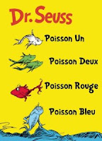
Poisson Un Poisson Deux Poisson Rouge Poisson Blue by Theodor Geisel (Scott Steesy, Chief Software Architect)

For some light mathematics.


To Sell is Human by Daniel H. Pink (Sheryl Kovalik, Director of Sales & Business Development – Higher Ed)

Being a big fan of sales, I was naturally excited to read a book that gave me excellent perspective on how access to information has changed the buyer/seller relationship; I also enjoyed Pink’s march through the history of sales and his advice on how to adapt for the new environment. But the best part of the book was the way in which the author helps one to see that all of us are sales folks in some way. If you’re in fundraising, admissions, technology, or service positions, there is something here for you – we’re all trying to sway others to our side!


The Signal and the Noise by Nate Silver (Caitlin Garrett, Statistical Analyst)

Named Amazon's #1 Best NonFiction Book for 2012, I'd say this book is proof positive that predictive analytics is going more mainstream. As a thought leader in the field, Silver's book is chalk full of examples of the practical applications of predictive modeling. A great read for the technical and non-technical alike.


Have you read anything good lately? We're always looking for recommendations - tell us about it in the comments.